Astrato, by Vizlib
Overview
An end-to-end project for a cloud-native SaaS solution, leveraging the flexibility and performance of Snowflake’s cutting-edge cloud data warehouse.
Outcome
The launching of Astrato, a scalable no-code platform for visualisations and analytics on Snowflake, without data replication and providing competitive advanced features.
Role
Sr Product Designer
UX/UI/Research
User Testing
Leadership
Worked with
Founders
Product Managers
Developers
BI Developers
Branding
Brand
Astrato, by Vizlib
Initiate
Who is Vizlib (Insightsoftware)
Vizlib builds extensions for Qlik Sense, a major player in the data analytics world, empowering users to extend their analytic capabilities and create visually compelling dashboards.
Being restricted by the Qlik Sense’s customer base, the founders set out to broaden their horizons, and create a standalone solution, using all their acquired knowledge of the industry.
Problems Vizlib Saw
Executive adoption: 77% of executives struggle with big data adoption.
Data challenges: Organisations face roadblocks in defining data extracts & transformations.
Visualisation gap: Significant challenges in using visualising data solutions.
Single source of truth: BI solutions must connect to a single/unified source of truth.
Benefits of a Cloud Data Warehouse
Enhanced data sharing (source of truth).
Improved speed and performance.
Increased data storage.
Near-infinite scalability.
Better disaster recovery.
High-Level Project Objectives
Provide a platform that allows both the author and consumer to interact as well as create compelling dashboards.
Build a navigational overview of available assets, serving as the starting point for various workflows, not content creation itself.
Allow user to enrich their data sources with metadata, simple transformations, and formatting, accessible and modifiable throughout the software to enhance dashboards.
Discover
User Interviews
Leveraging internal and external (Legend’s community) industry knowledge, I began interviewing BI developers to validate the founders vision.
“A standalone visual first, no-code data analytic solution, utilising Vizlib’s visualisations technology and Snowflakes cloud data warehouse”.
In addition to user interviews, I conducted workshops and observation sessions to get insights into their Pains, Gains, Tasks, and the tools used (e.g. Qlik Sense, Tableau, and Power BI).
Insight examples (The Expert):
Pains:
Spend more than 80% of their time cleaning up and preparing their data.
A broken app because the data model has changed.
Gains:
Tech needs to feel familiar.
Connect to data from anywhere.
Tasks:
Explore and get new insights out of data.
Share dashboards easily.
Advanced operations beyond no-code.
Building Out The Personas
We defined two core personas, prioritising “Expert” and combining novice/consumer insights into “Business User”.
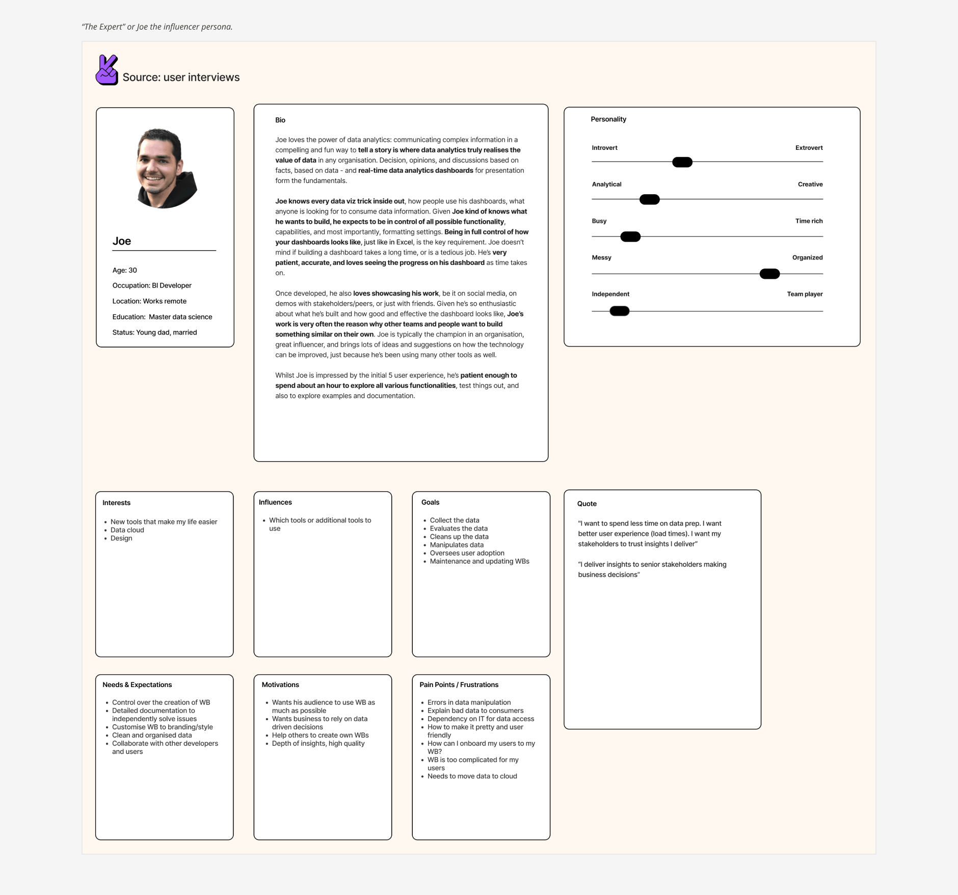
“Expert” or “Joe”
Our main persona is “Joe”, a technical minded BI Developer, familiar with visualisation tools and has the expectation and need for technical features.
“I want to spend less time on data prep. I want better user experience (load times). I want my stakeholders to trust insights I deliver”
“Business User” or “Juste”
The business user is “Juste”, consumes the data visualisations for business analysis, reports on business metrics and to understand the dependencies to make business decisions. They may have the need and wish to independently create data analytics without having to wait for internal support from the expert.
“I use Insight to drive performance”
Competitor Analysis
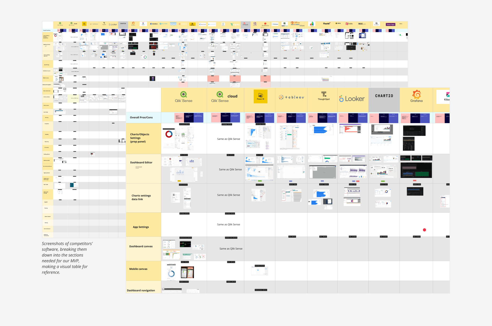
In collaboration with a founder, we conducted a comprehensive competitive analysis. This involved:
Gathering screenshots of competitor platforms.
Highlighting the pros, cons, and use cases for each platform.
Creating a visual reference table to facilitate a shared understanding of features, terminology, and sections.
This analysis highlighted the key differentiator of the founders vision: a visual-first approach that competes effectively on advanced data features.
User Story Mapping Exercise
We used user story mapping to define high-level key user activities (Onboarding, Connect, Create, Playground, Present) and populate it with features to further investigate later.
This exercise helped us prioritise milestones and our development roadmap.
Ideate
Documentation & Box Wireframes
I began visually exploring the user activity sections and features, creating box wireframes, mainly to complement the high-level documentation (epics) for key sections like the Lobby, Workbook Editor, and Data View Editor.
The Lobby (First Generation) Epic:
Overall goal: The Lobby acts as the central navigation point, providing an overview of available assets and access to other parts of the software. Primarily targeted at “Business Users” searching for content, but also optimised for “Expert” needing efficient navigation.
Key functionality:
Asset discovery: Users should be able to efficiently sort and filter lists of entities to quickly find relevant assets.
Navigation: Surfacing different user tasks and workflows (e.g. Workbooks, Datasources, Collections).
CRUD operations: Users should have appropriate access rights to perform Create, Read, Update, and Delete operations on key entities.
Metadata management: Users should be able to update the metadata associated with entities.
Administration and help: Users should be able to customise settings and easy access to help documentation.
Call to actions: Prominent CTAs will encourage adoption (e.g., Create, Invite Users, Share Content).
High-Level User Tasks & Taxonomy
In addition I explored the Lobby's user task hierarchy, when connecting to data, creating workbooks, and managing collections. Exploring possible scenarios for the Lobby's taxonomy at this stage, helped me proceed more confidently, and provided additional context for informed decision-making.
Workbook Editor (Core) Epic
Overall goal: The Workbook Editor should provide an intuitive and user-friendly interface for creating and interacting with workbooks. Authors should be able to quickly design workbooks using templates, flexible sheet layouts, and a drag-and-drop interface.
Key functionality:
Editing: Undo/redo functionality for changes made to the canvas (adding, removing, moving objects) and workbook settings (e.g., applying themes).
Object management: An object toolbar for easily adding elements to the Workbook Editor canvas.
Styling: Workbook theming capabilities.
Sharing & distribution: Ability to schedule and distribute snapshots of the entire workbook to different channels (Slack, email, Teams) at defined frequencies.
Presentation mode: Full-screen/presentation mode with no toolbar, and the ability to share a link that opens directly in this mode.
Exporting: Ability to export the entire workbook as a PDF, as well as individual sheets.
Object properties: Access to the properties of each object when in creation mode.
Responsive design: As an consumer, users should be able to view sheets optimised for tablet and mobile viewing.
Data View Editor (First Generation) Epic
Overall goal: Empower users to enhance their data sources by adding, performing simple transformations, and applying formatting. This enriched data will improve the quality and usability of data within the workbook.
Key functionality:
Measures & Dimensions: Users should be able to tag fields as either dimensions or measures. This classification will improve the user experience for authors by facilitating better sorting and organisation of data fields within the UI.
Field renaming: Users should be able to rename fields or create aliases. This separation of the presentation layer from the underlying data allows for greater flexibility in how data is displayed and used.
Combining fields: Users should be able to combine two or more fields of the same data type to create a new, composite field (e.g., combining "FirstName" and "LastName" to create "FullName").
Field formatting: Users should be able to apply different formatting patterns to various field types, including strings, numerical values, and date/time fields.
Custom queries: Users should be able to define custom queries that can be used within the UI to retrieve and manipulate data.
Data modelling (Joins): Users should be able to add multiple views/tables to the data model, and define how these different views/tables relate to each other.
Reflection: Box wireframes were not created for the Data View Editor in this phase. In retrospect, given its complexity and importance within the user journey, earlier exploration of this section would have been beneficial. It was a business decision to prioritise a visual-first approach, which influenced the focus of the initial design explorations.
Define & Design
User Journey
Having developed the foundational concepts and documentation, we proceeded to map the complete user journey, carefully considering the unique roles and interconnections of the various product sections.
Defining The Lobby
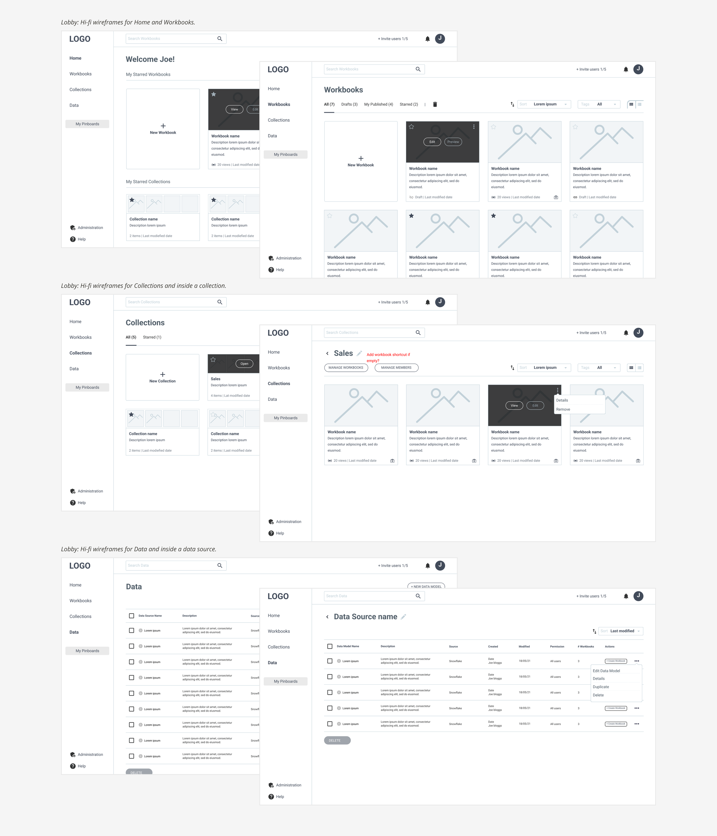
To translate the high-level epics into defined designs, I created hi-fi wireframes and user task flows for the Lobby, focusing on specific user tasks. Key functions included:
Navigation panel.
Consistent CTAs to initiate workflows.
Tile/list view options for assets (image, title, description, date, tags [draft vs. published]).
Filter and delete.
Admin and help placement.
Invite users and share assets.
Dialogs.
A specific user task flow example, was editing a published workbook from the Lobby, detailing the key dialogs presented to the user, and the point at which file duplication occurs, and surfacing available options for publishing the updated or new workbook.
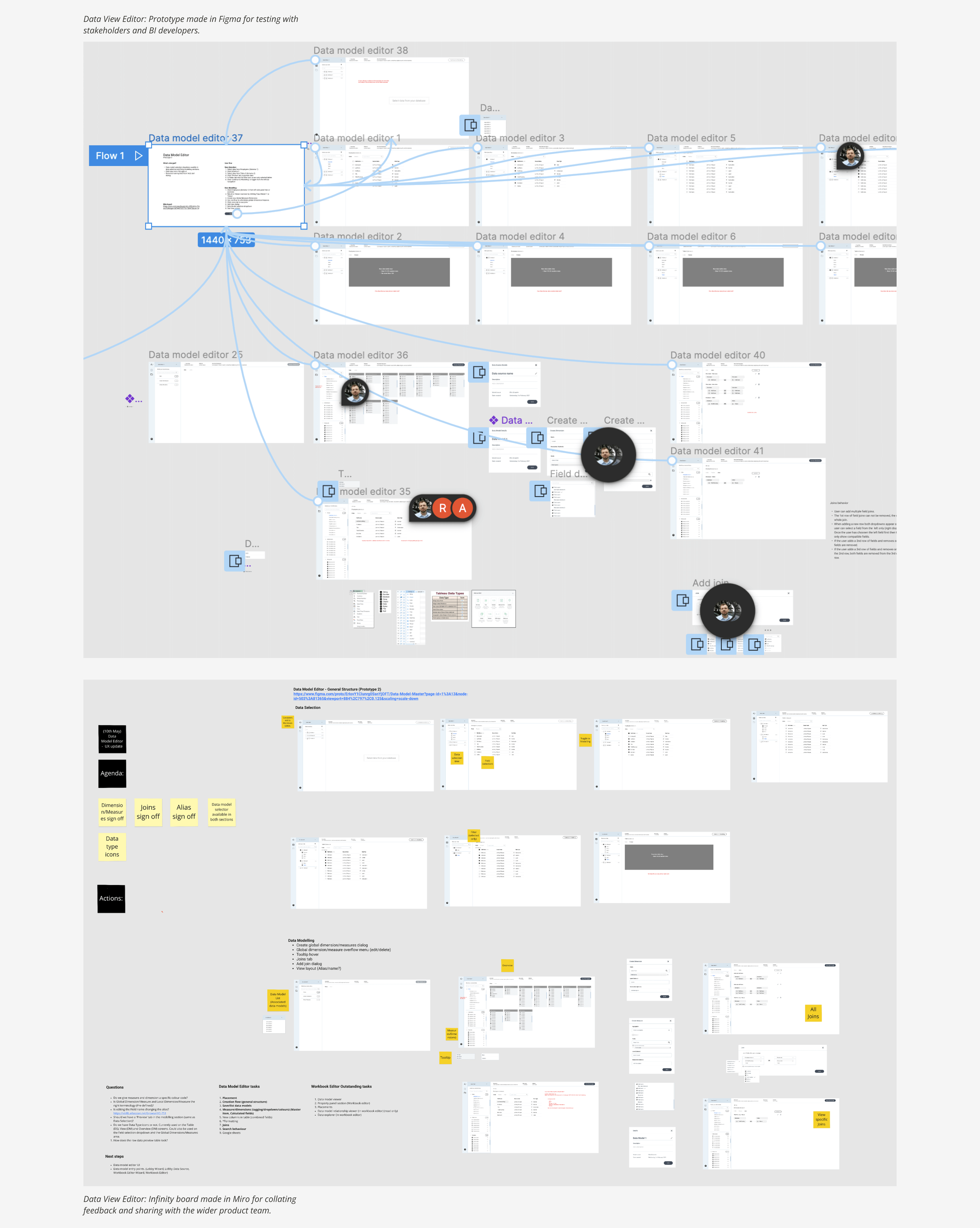
I created prototypes for BI developers and stakeholders, gathering their feedback and organising it on a shared infinity board, making it readily accessible to the entire product team.
Lobby UI
The Lobby serves as the user's starting point after signing up for Astrato. It provides access to key sections:
Workbooks: Manage draft and published workbooks containing data objects and visualisations.
Collections: Organise and group workbooks for easier management.
Data: Manage data views and data sources.
Administration: Manage system settings, people and billing.
Help & Communities: Access to help documentation for features as well as feedback portals.
Prominent CTAs in the top right corner guide users through the creation of new workbooks and collections, as well as connecting to new data sources.
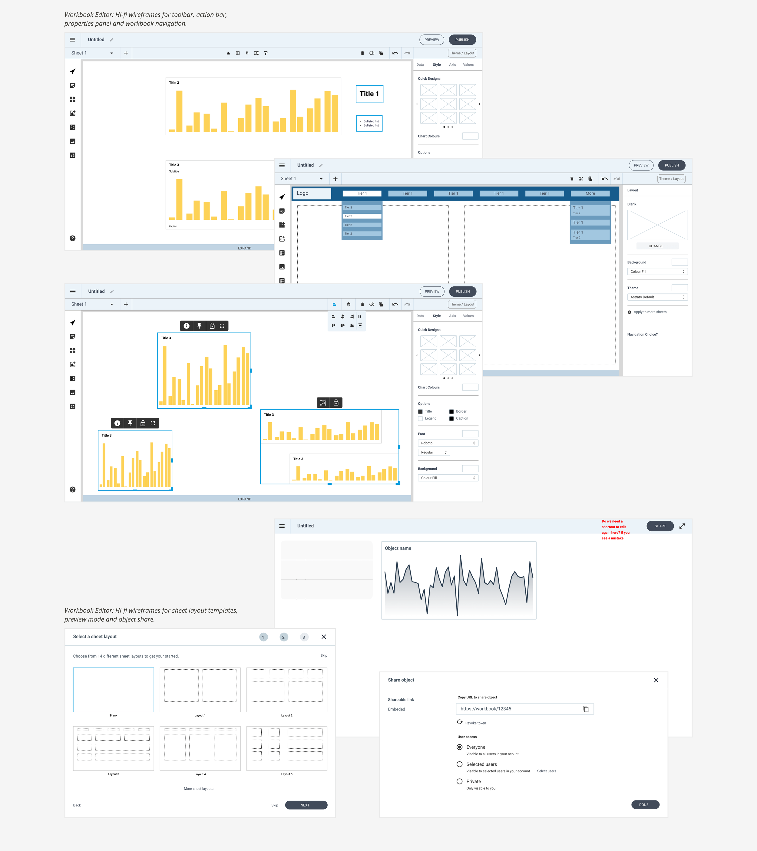
Defining The Workbook Editor
Working with a different product manager, and with a clear understanding of the Workbook Editor's role in the user journey, I designed hi-fi wireframes incorporating the feature requirements. Key functions included:
Defining the chrome area (title bar, actions bar, toolbar, properties panel).
Canvas.
Actions and tools.
Properties panel tabs.
Inline action bar.
Editor vs. consumer mode (Publish).
Dialogs.
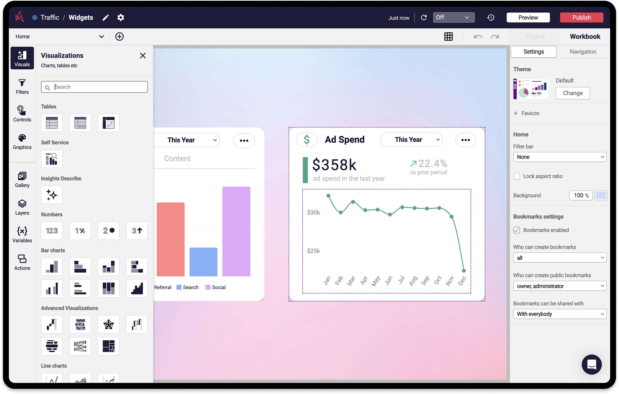
Workbook Editor UI
The Workbook Editor empowers users to design, build, test, and publish data visualisations and interactions. Key UI elements include:
Header: Workbook top-level controls (Data connection name (links to Data View Editor), Workbook name editing, Refresh, Preview, Publish).
Action Bar: Layout and sheet management (Add Sheet, Undo/Redo, and context-sensitive options).
Toolbar: Visuals (data objects) and controls for creating interactive content (select/click or drag-and-drop).
Properties Panel: Appearance management (Workbook, Sheet, and Object tabs with context-sensitive settings).
Defining The Properties Panel
The Properties Panel became a distinct section within the Workbook Editor, requiring diverse configurations depending on the object type (e.g., Line, Scatter, Bar chart, Shapes, Images).
Card sorting exercises helped group actions/properties (e.g., Label, Legend, Colour, Border) into hierarchical tabs (Data, Style, Axis).
Working with a dedicated product manager, we further developed the Properties Panel, creating hi-fi wireframes that incorporated a new tab structure: "Item" (later renamed "Object") and "Workbook."(dashboard as a whole). Key functions included:
New tab structure/tier, Item (Object) vs Workbook.
Detailed chart scenarios, Line Chart, Scatter, Bar Chart, and other chart types.
UI Consistency, Radio buttons, Checkboxes, Expand/select controls and other interactive components.
Properties Panel UI
The Properties Panel, located on the right side of the Workbook Editor, provides granular control over the appearance of workbooks and their contents. Properties are organised into two top level tabs:
Workbook: Appearance of all sheets or the active sheet, including Navigation properties.
Object: Properties for the selected object (e.g., Line chart, Bar chart).
Once a data object is added, its properties appear. Users can add data and customise the object's appearance. Object level tabs include:
Data: Dimension and Measure selection.
Style: Chart type and colour palette.
Axis: Axis title, labels, range, and gridlines.
Based on Vizlib’s extensions knowledge, the initial nine objects were Line, Bar, Combo, Scatter, Number, Pie, Calendar, Heatmap, and Table charts, along with Shapes and Text box graphics.
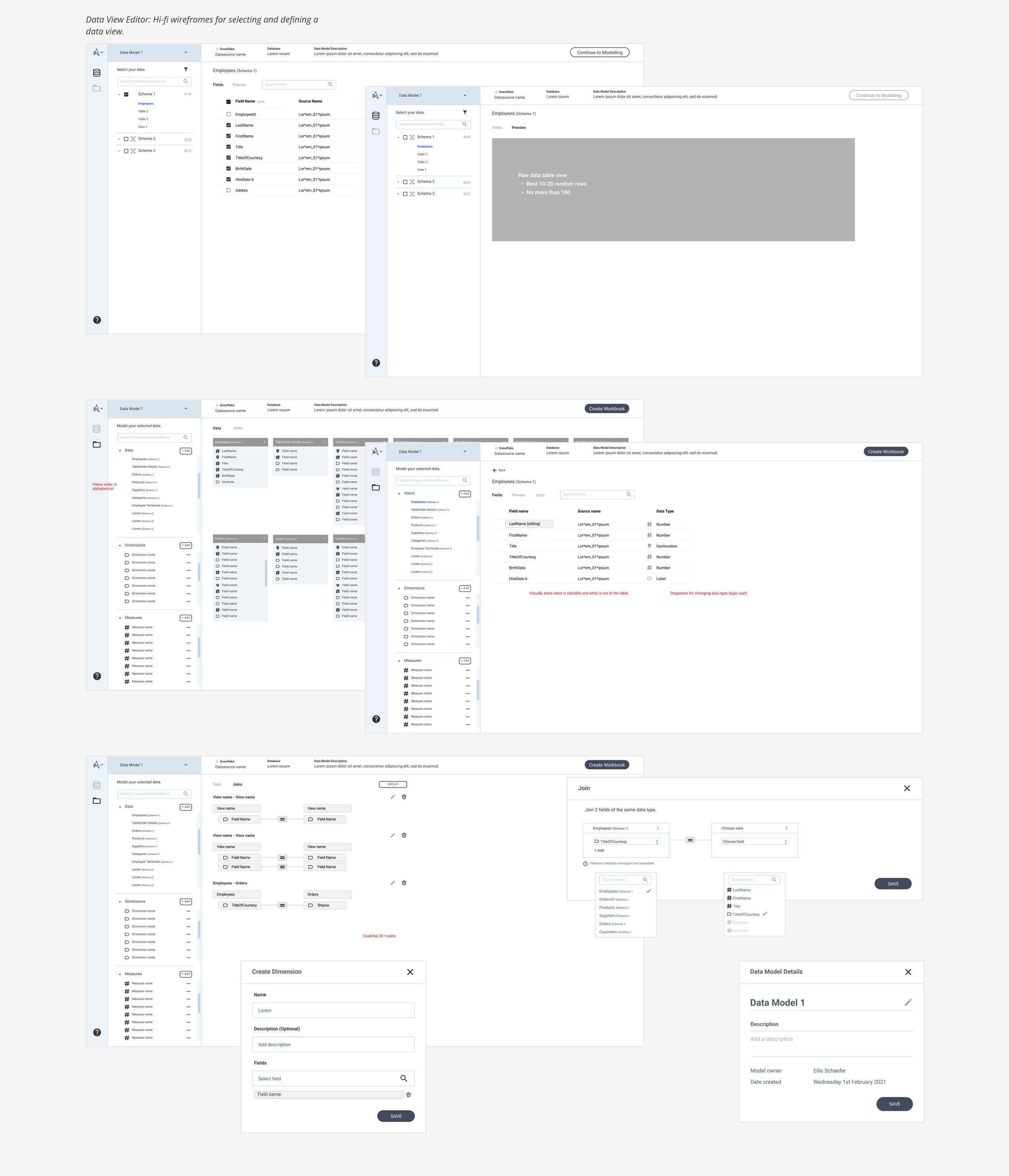
Defining The Data View Editor
Initial research highlighted the importance of data visibility in the workbook creation process. However, to reinforce our visual-first approach, we strategically separated the data modelling section into its own editor.
I created a user flow diagram to show how data modelling could be accessible from the workbook creation stage, identifying key entry points without disrupting the visual-first flow.
Close collaboration with the data engine team, including regular reviews of the hi-fi wireframe, was crucial when prioritising, and defining the core features. After careful consideration of a split-screen vs. linear flow, we opted for a linear flow to better guide ‘business users’ through the data modelling process, while still providing easy access to advanced features for ‘expert’ users. Key functions include:
Navigational bar (linear flow with Select/Define stages).
Data selection and search functionality.
Schema/Table view.
Datasource and information bar.
Visual data overview.
Dimension and measures.
Joins interface.
Language was very important, striking a balance between being technical, and human for the ‘business user’. The whole process went well, and quickly due to the team being very supportive, answering all my questions no matter how trivial.
Data View Editor UI
The Data View Editor (DVE) allows users to connect to data sources and define the data they want to use in their visualisations. After connecting, users select the relevant tables in the "Selection" section. The DVE offers two primary sections:
Select: Used for previewing and choosing the tables from the connected data source.
Define: Allows users to customise their data view by:
Adding dimensions: Qualitative values (e.g., product names, countries, dates, IDs) that define the level of detail in visualisations.
Adding measures: Numeric, quantitative values that can be aggregated (count, sum, average, minimum, maximum).
Field transformations: Renaming, Combining, Formatting.
Joins: SQL clauses that query and access data from multiple tables based on defined relationships.
A clear Call-to-Action in the top right corner guides users to the Workbook Editor, where they can begin visualising their data.
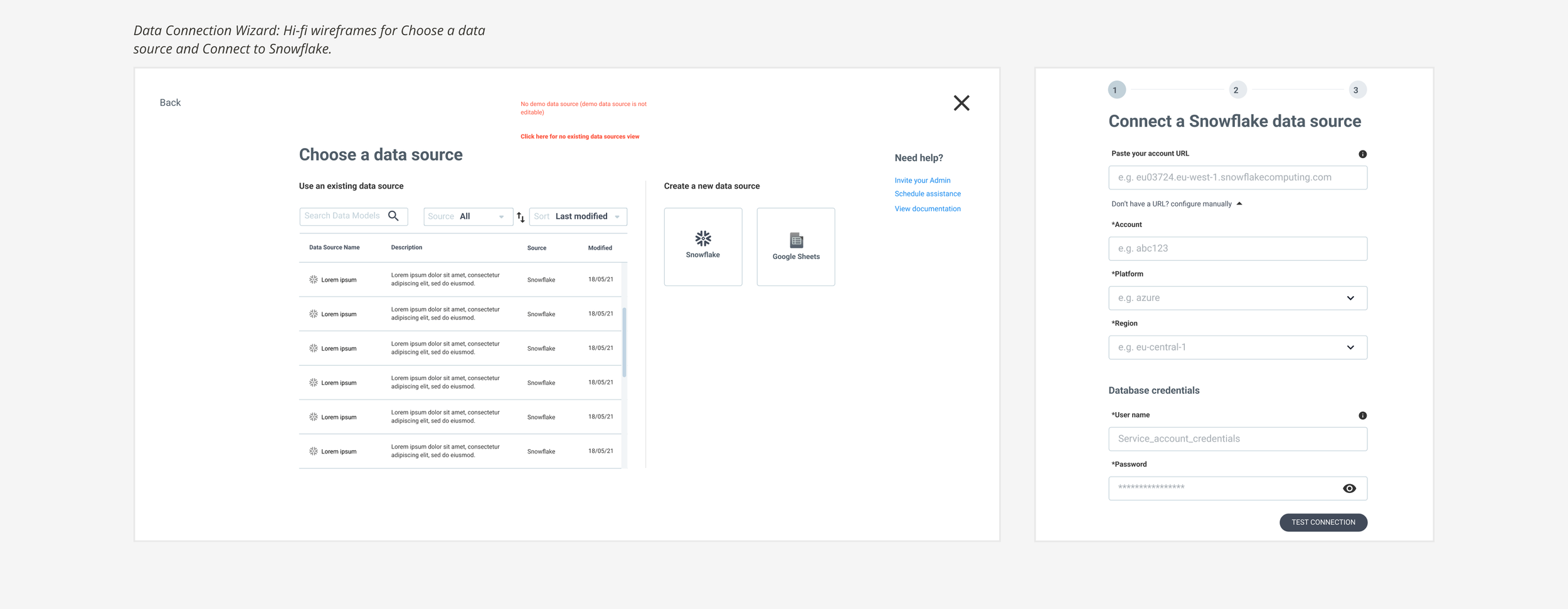
Defining The Data Connection Wizard
The primary method for creating data connections is a full-screen wizard, accessible directly from the Lobby. The wizard was designed with simplicity and ease of use as top priorities. The initial release supports connections to Snowflake and Google Sheets, with the intention of adding support for other data source types in the future..
Data Connection Wizard UI
Connecting to a data source involves several steps requiring specific information. For Snowflake, these include:
Choose database: Select "Snowflake" as the database type.
Name connection: Provide a descriptive name for the data connection.
Account details: Enter the necessary Snowflake account details. Users can choose between:
Paste account URL.
Configure manually, Account, Platform, and Region
Database credentials: Provide the Username and Password for accessing the database.
Database details: Enter the Database Name. Users can additionally select the Role and Warehouse during this step.
The UI design emphasises a clean and simple layout, using large input fields, live validation messages, human language, and multiple steps to ensure a user-friendly experience and avoid information overload.
Astrato Brand
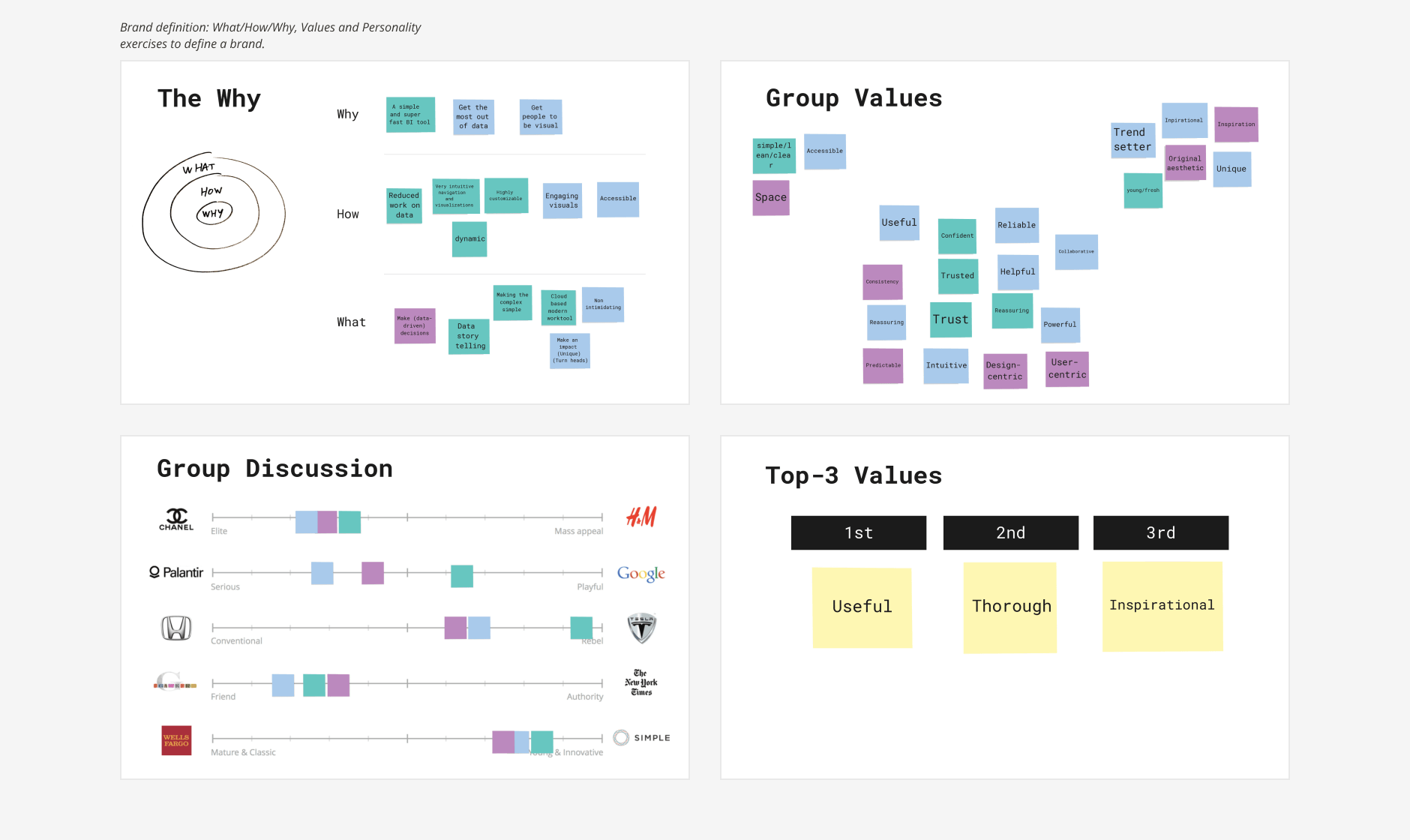
Even though the marketing/brand team was still forming, the Product Design team took the initiative to begin experimenting with a look and feel. Through exercises exploring the brand's "Why," "Values," and "Personality," we identified three core brand values to guide design decisions:
Useful: We strive to be helpful, satisfying, accessible, intuitive, and collaborative, empowering users and teams to achieve their data-driven goals.
Thorough: We are committed to reliability, reassurance, predictability, consistency, and design-centric thinking, providing trusted and comprehensive solutions.
Inspirational: We aim to be impactful, confident, clean, trending, and fresh, inspiring users to think differently about data and its potential.
Moodboards
Based on our brand values, we created and presented moodboards to stakeholders, gathering feedback to maintain momentum and help inform brand direction.
Brand Guidelines
Leveraging our initial branding explorations, the newly formed Marketing team quickly supplied us with core brand assets, such as, font, and a high-level colour palette.
They then proceeded to develop comprehensive brand guidelines, encompassing brand positioning, core values, personality, tone of voice, logo usage, typography, brand graphics, and other essential elements.
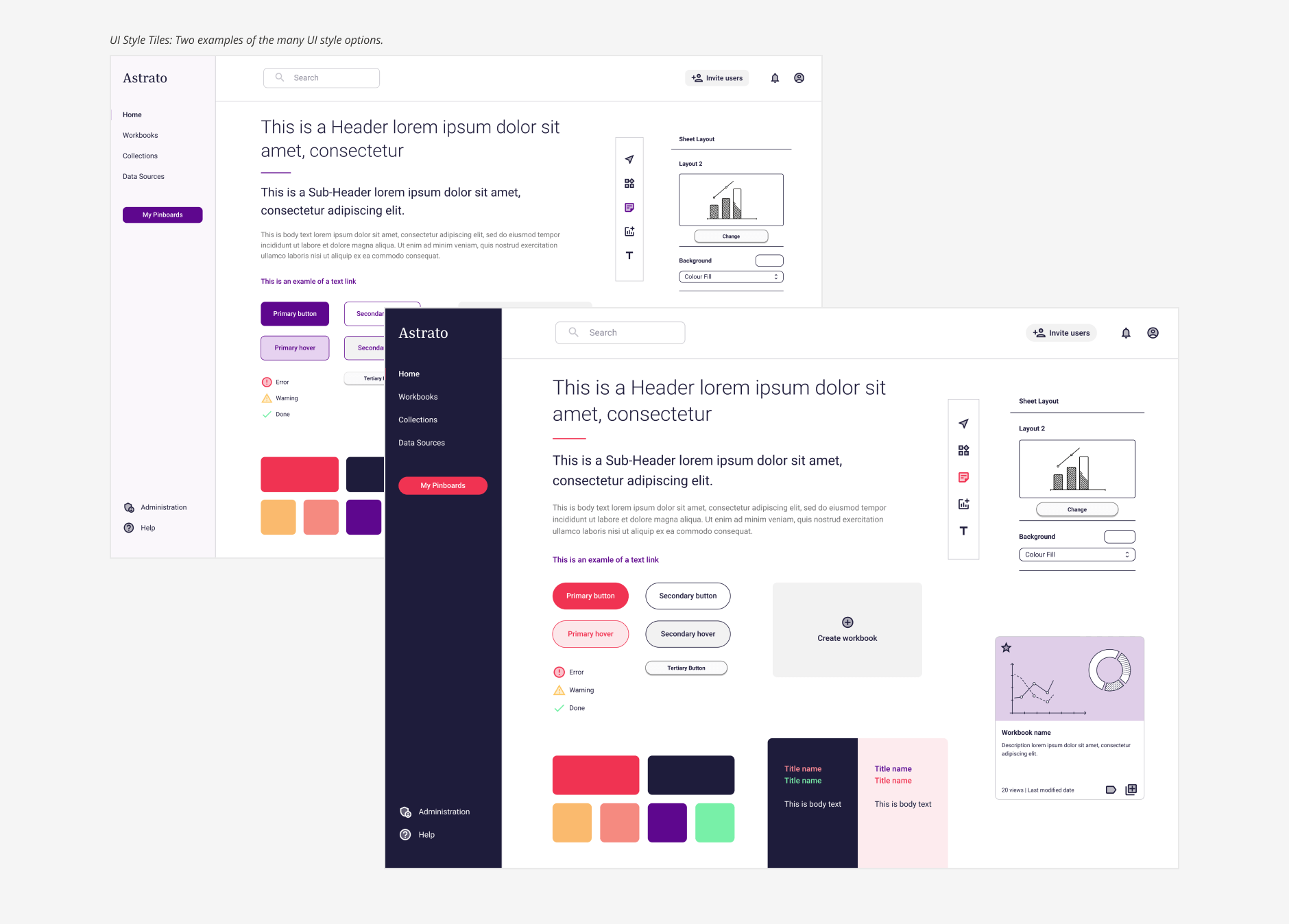
UI Style Tiles
I began defining the UI style using approved core brand assets, creating UI style tiles to explore various visual treatments for key components, including navigation, headers, body copy, buttons, and iconography. After a process of elimination, three finalists were presented to key stakeholders.
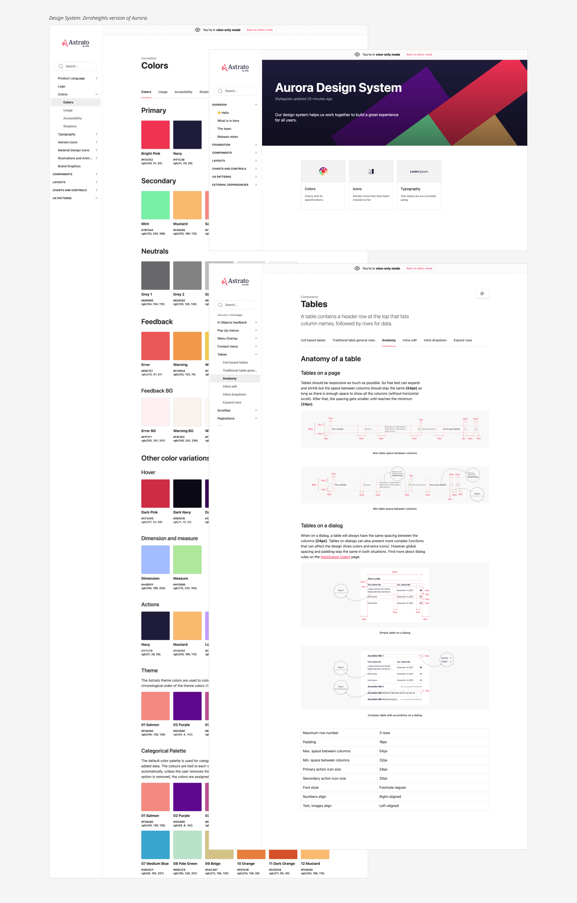
Design System
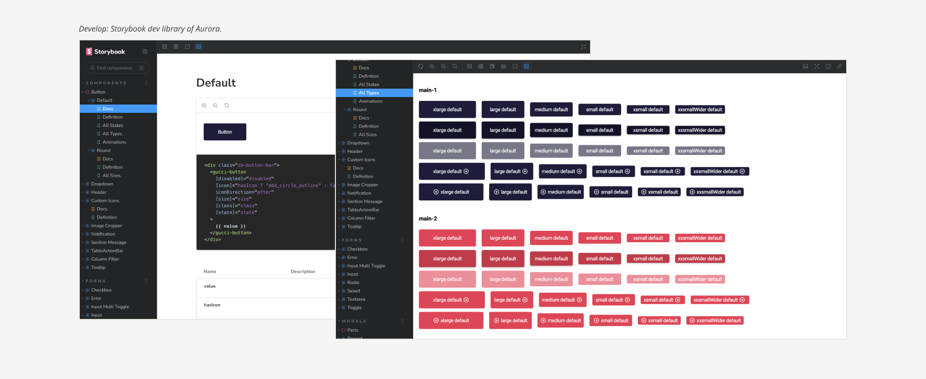
The Aurora Design System, our single source of truth for visual style and UI elements, ensures a consistent user experience. Inspired by Atomic Design, it facilitates collaboration among designers, and developers. Components are designed and validated in Figma, documented in Zeroheights, and implemented in Storybook, mirroring the design system and enabling thorough testing..
Design Principles
Our design philosophy is guided by the following principles:
Fast, effortless, intentional interactions: Prioritise frictionless, obvious interactions for simple tasks, and efficient, delightful experiences for complex tasks, without sacrificing accuracy.
Question & research: Challenge biases through healthy discussion and user-informed design. Conduct competitor analysis and define the core user task.
Conversational & human: Build user confidence with clear, human-centric language.
Progressive discoverability: Empower all users, regardless of experience level, to confidently use Astrato's features.
Consistent & standard, innovate when worth it: Balance familiarity and modernity.
User advocacy: Prioritise user learning and needs alongside business growth.
Visual language: Utilise iconography, animation, simple language, and common industry terms to enhance understanding.
Accessibility: Maintain simplicity for inherent accessibility benefits.
Develop
Our development process emphasised collaboration and agility, incorporating the following key elements:
Agile tribe structure: Two-week sprints and regular builds ensured rapid iteration and delivery.
Jira: Used for comprehensive documentation and issue tracking.
Storybook: Served as our frontend development component library, enabling isolated UI development and mirroring the Aurora Design System for consistency.
Design parties: Collaborative sessions bringing together QA, developers, and designers to proactively discuss technical requirements and upcoming features. These sessions aimed to identify potential problems early and develop optimal solutions within the development effort, resulting in fewer bugs and improved efficiency.
Measure
Monitored Testing
Observing internal and external BI developers, in controlled environments, guided their first-time experience and evaluated specific features.
Testing was controlled, using scripted scenarios.
Conducted testing with 3-5 users, for each experiment.
Insights were documented in Glean.ly and sometimes emotional mapping.
Findings were presented to stakeholders for roadmap prioritisation.
Unmonitored User Testing
To further accelerate user insight gathering, we evaluated unmonitored online user testing platforms, including Maze and UserTesting.
Selected UserTesting as our primary platform for regular unmonitored sessions.
Additional useful features such as heat mapping.
These sessions complemented our monitored user testing program, providing fresh perspectives and enabling quicker insights.
UserTesting Session.
UserTesting Metrics.
Scalable Research Repository
Glean.ly was used to consolidate and tag user testing insights, making them accessible to the entire team.
Its point system prioritised feedback, informing design decisions.
Easily sharing insights with tribes and stakeholders proved essential for justifying design choices and driving new feature development.
Conclusion
After six months of research, design, development and team expansion, we launched Astrato's closed beta, followed by a general launch six months later. To monitor user activity we implemented event triggers, tracking key actions like sign-ups, data connections, and workbook/visualisation usage. This data informed the ‘First Time Experience’ project, aimed to streamline onboarding and ensure new users quickly realised Astrato's value


